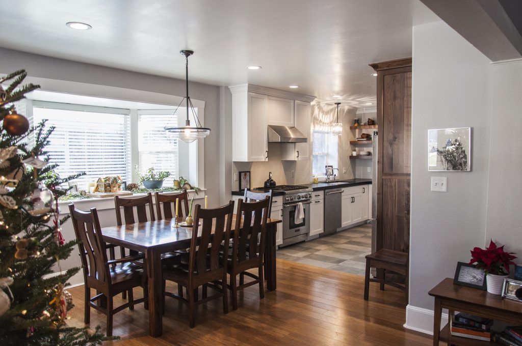
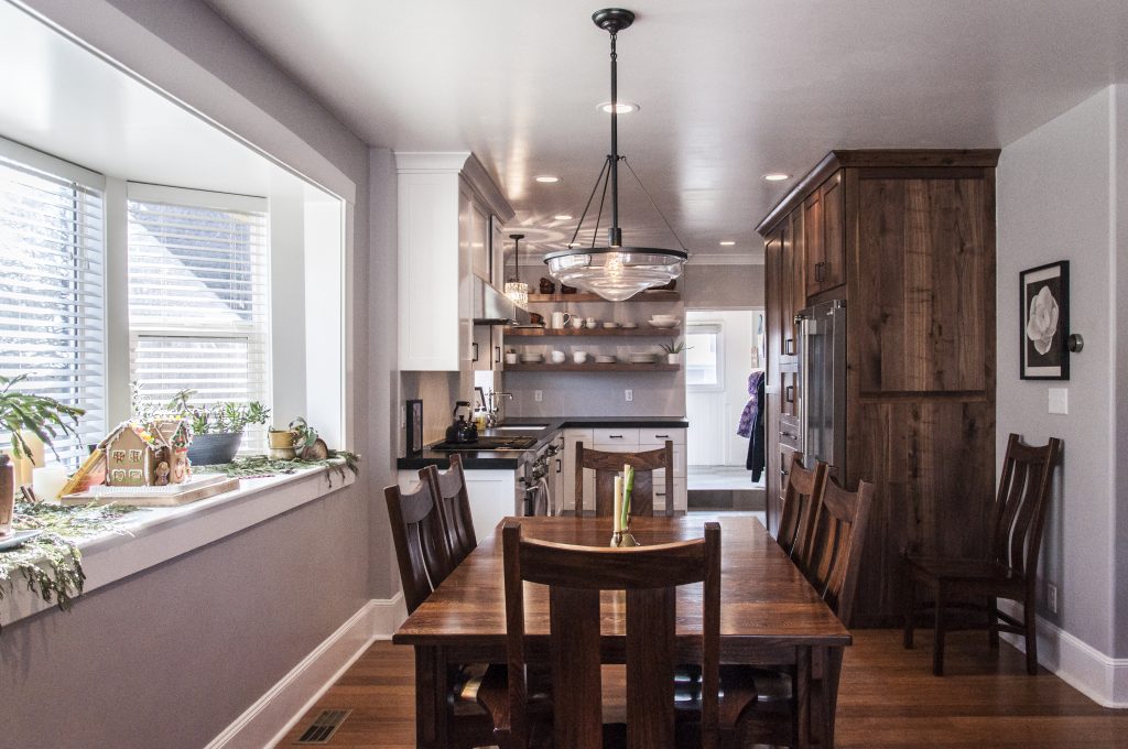
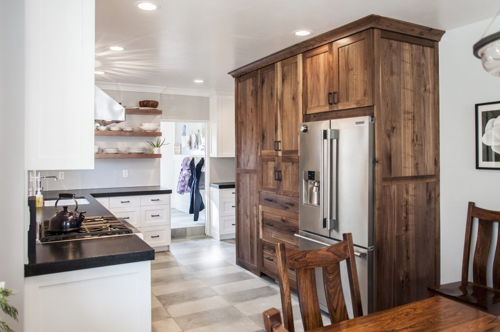
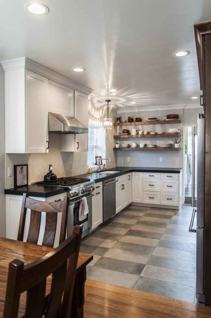
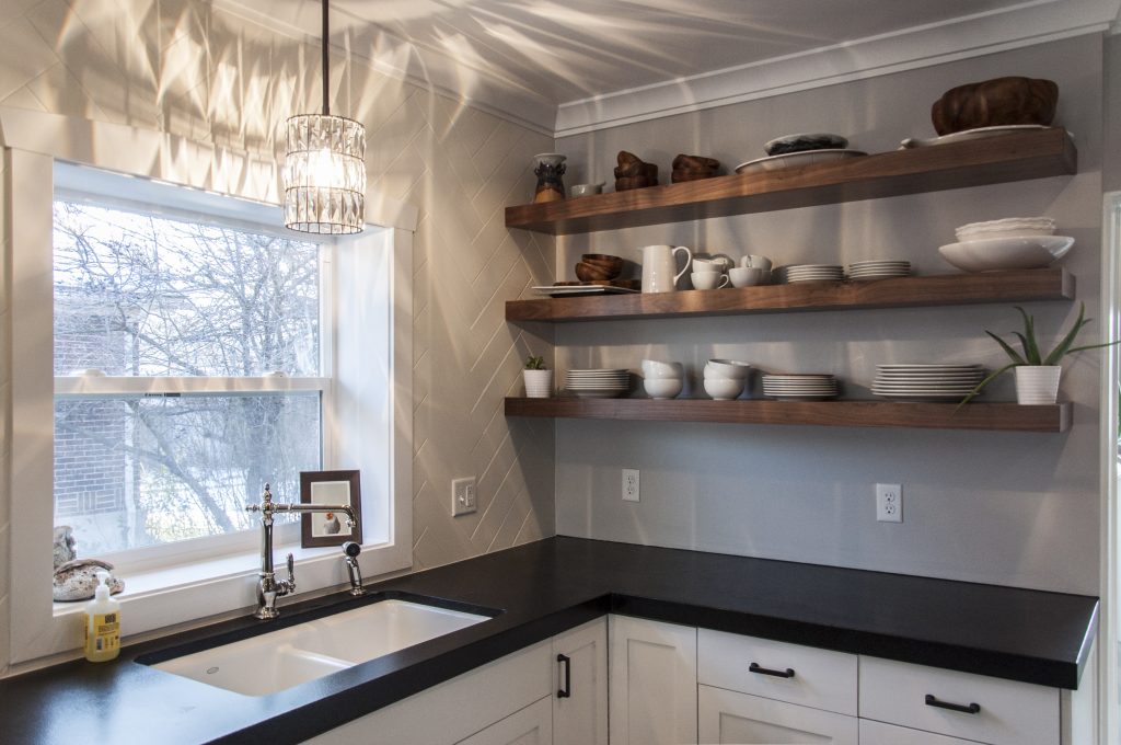
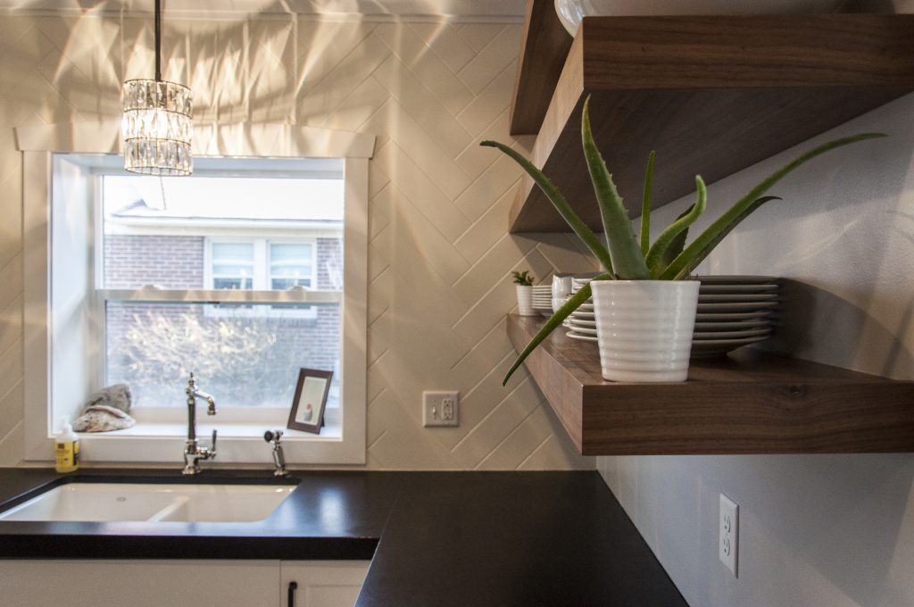
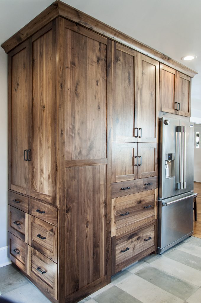
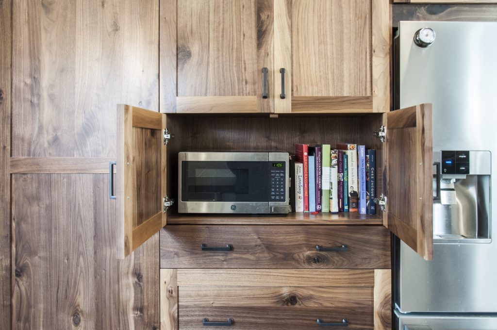
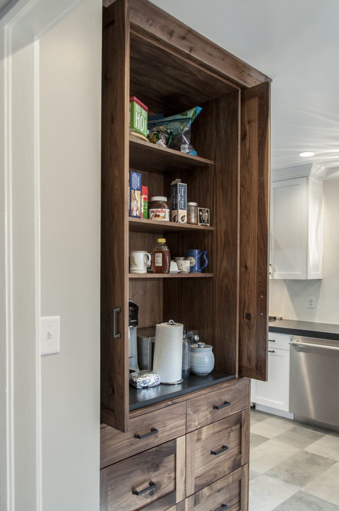
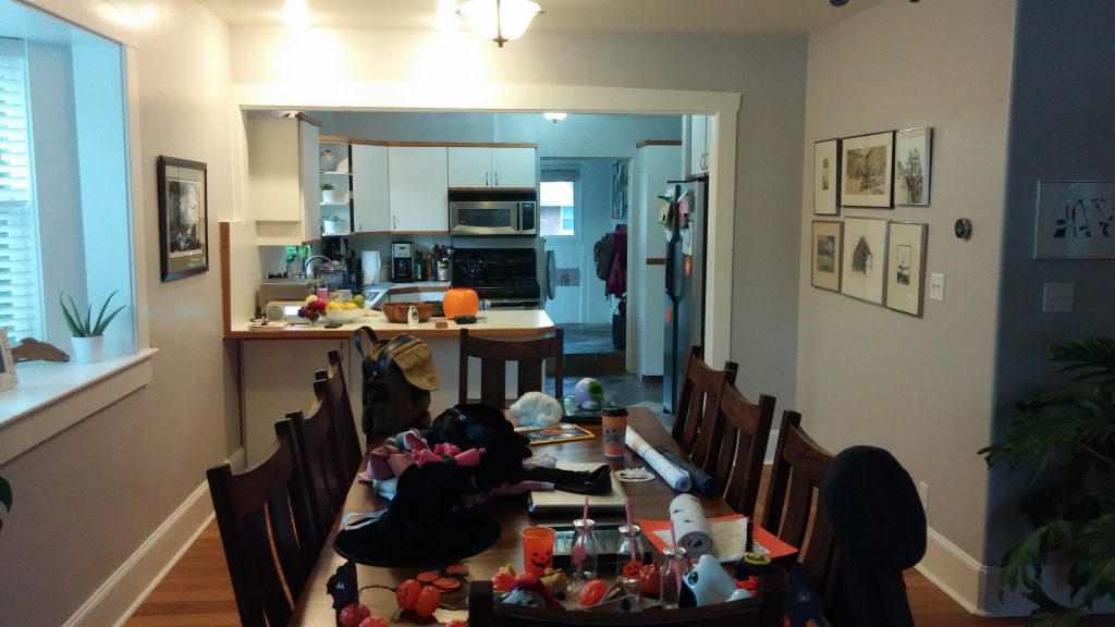
Sometimes, in renovations, we have carte blanche. Other times, there are limits to how much can, or should, be changed. In this renovation, the homeowners loved everything about their home except the kitchen. While the location in the home worked, the layout didn’t. Neither did the finishes. To address this, we took two feet of space from the adjacent, oversized dining area; this allowed us to create a new kitchen layout that improved movement, increased work space, and provided additional storage. To compliment the arts and crafts character of the home, we selected classic shaker cabinetry, in contrasting finishes. The walnut cabinetry conceals a butler’s pantry and is detailed to feel more like a furniture piece within the space. To provide a modern twist, a subtle checkerboard pattern was used for the floor tile, and an elongated subway tile was chosen to create the herringbone patterned backsplash.
Category Residential, Interior Design
Share
Related Projects
Overview
